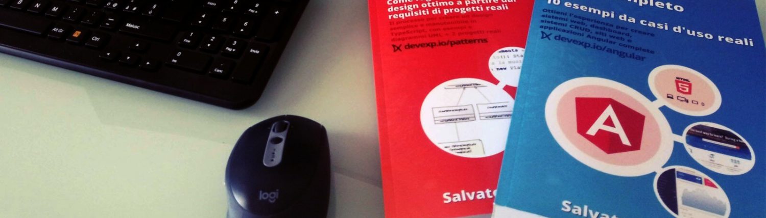

Il libro definitivo per imparare Angular, con esempi, codici e l'esperienza che serve per essere efficaci nello sviluppare siti, dashboard CRUD o web-app mobile (Raccomandato con un punteggio di 5 stelle su Amazon)
Info sul libro + Codici e demo delle esercitazioni Libro stampato Kindle
C'è una differenza tra programmare e progettare un software: il design. In questo libro viene mostrato il processo per arrivare ad un design semplice e manutenibile attraverso i design pattern
Info sul libro + Codici delle esercitazioni Libro stampato
KindleIs it complicated to design a web project? What about a mobile application? Are there any design techniques that even a front-end developer can learn and apply? And how complicated are these techniques?
Often a developer has no design knowledge, maybe because he thinks designers born this way. The reality is that the basic rules are simple and can always be applied to a sketch or a mockup. We will see here the CRAP techniques (contrast, repetition, alignment, proximity) and some hints about fonts, colors and icons, but, more importantly, we will contextualize these techniques to the web world and apply them in front-end development.
Introduction
In the previous article we saw the basics of UX and the tools to create a mockup. However, it is also necessary to know how to use these tools from an aesthetic point of view.
In this chapter we will deal with how to make a Web project elegant and aesthetically beautiful to see. The basics that we will learn can actually be applied to every graphic project, but we will try to learn them from the point of view of the front-end developer, who often tends to create designs that are too bold.
CRAP: contrast, repetition, alignment and proximity + the mockup tools to apply these techniques

When I first read the book The Non-Designer-s Design Book by Robin Williams I was fascinated (https: //www.amazon .ca / Non-Designers-Design-Book-4th / dp / 0133966151).
From that moment on, every time I design a graphic interface, I strive to respect the basic principles described in that text. There are a few techniques that allow anyone (even us developers who often don’t have a graphic soul) to make a project harmonious and not incur in visual disasters.
The 4 principles we are going to see are:
- contrast
- repetition
- alignment
- proximity
If you notice, the first letters of each principle form the word CRAP, that is exactly the opposite of what we want to achieve. And the contrast between the meaning of the word CRAP and what we can achieve by respecting these principles will ensure that we will never forget these 4 techniques.
So let’s explore and understand how to apply them in the most common design tools.
Contrast
Need
With this technique we can direct the user’s attention to specific elements. The contrast will allow us to create graphic structures and to give greater or lesser importance to the various parts of our design.
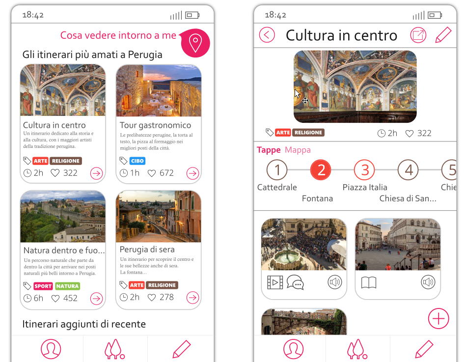
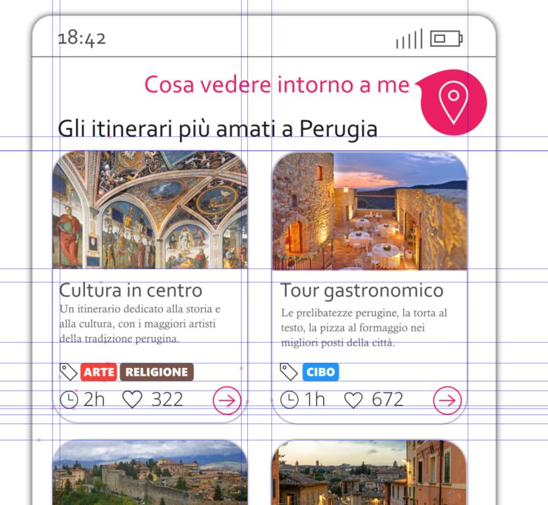
If we look at the mockup above, for instance, I wanted to make the user understand that he can interact with some parts of the interface: all the elements in pink are clickable. Moreover, among all of them, there is a clickable element that is obviously more visible than the others: the button on the upper right corner. This button, besides being bigger, also has a shadow to stand out.
Understanding the contrast from an example
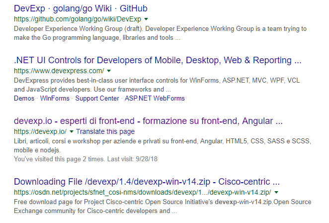
Let’s imagine a web page without images and in which title, paragraphs, menus and any other text all have the same font, the same size and the same black color on a single white background.
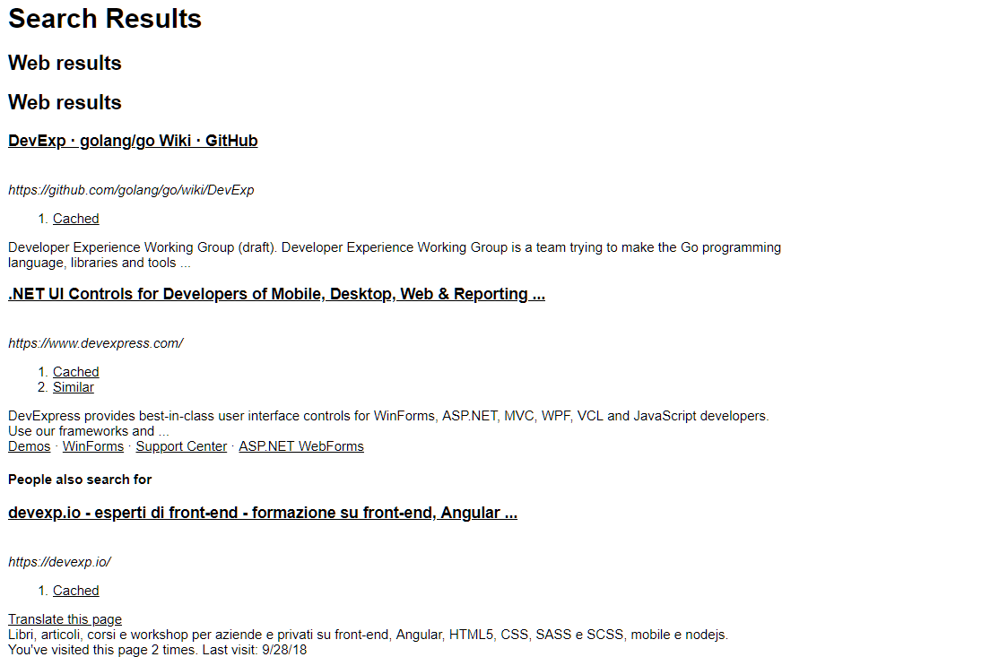
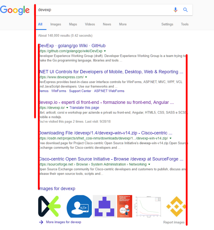
Do you recognize the page above? This is the ‘devexp’ search on Google. Difficult to navigate when there is no graphics. The first principle that allows us to make a better design is the contrast:
By creating contrast between the various elements we can easily identify the structures:
- the title (in blue)
- the link (in green)
- the description (black)
Color
Color is the first tool we can use to create contrast.
Different shades of color can be used to orient the user towards some elements rather than others: for example I could use three shades of gray for three different text elements, giving the most important texts the darkest color and the more clear to the less important ones .
Size
Another important tool to create contrast is the size of the texts and graphics. In the example above, in order for the user to give more importance to the title than the URL and the description, the title size is larger than the URL and description.
Generally a larger size allows greater importance to be given to an element.
Font
The font is a contrast tool that has a lot of potential. We have already said that the font size can be useful for creating contrast. When we use a font we can also create contrast by changing other features of the font:
- the family (as we will see later)
- the style (bold, italic, …)
On the fonts we could talk a lot and in fact later we will have a dedicated section. However, as specified below, using the right font also means understanding what emotions you want to convey, what is the purpose (reading? understanding? capturing attention?) And for this I would rely on an experienced designer to make the right choice .
Graphics to highlight elements
The last tool we’re going to see in this section concerns those graphic elements that are used to highlight an element. The most common is the shadow and, if we are not experts, I would tend to use shadows that are very light and centered with respect to the object. Almost all mockup software have specific tools for shading. Moreover, in vector graphics software, we can create a shadow with a very fine control starting from a shape and modifying its transparency, the shade of black and the blur. We will then place it under the graphic element that creates the shadow.
Below is an example on Inkscape (free on Windows, Mac and Linux).
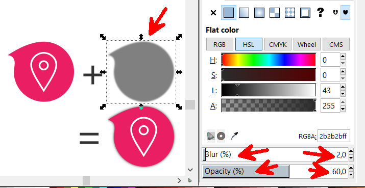
On a more abstract level, the shadow is something we can use to highlight. By leaving the blur at zero and / or using a color other than black, we can create different highlighting effects.
Repetition
Need
When we create a new web application, we cannot afford to use a style without rules. If we don’t have rules, sooner or later a page of pur website will be graphically different from the others.
When semantically related elements have different graphic styles, the user feels a sense of disorder and noise that makes them lose focus.
To avoid creating pages with inconsistent graphic structures, we,
as web developers , have two tools:
- the theme of our application
- the components (Web components)
Both of these tools will allow us to apply the CRAP technique known as repetition.
Understanding repetition starting from an example
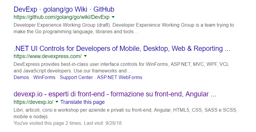
Repetition is perhaps the technique closest to the developer. In a nutshell it means to be graphically consistent. If we take the example of Google search results, we can immediately recognize the graphic style and the structure of the results.
Today this same graphic theme is used by almost all search engines with slight variations.
Repeating a graphic structure with the same colors and the same dimensions allows to create order and the user manages to orientate himself and recognize semantically common elements when they have the same graphic style.
Repeating colors and dimensions: the Theme
To be disciplined in the repetition of graphic styles for semantically related elements, we must define a theme.
The theme defines some basic rules of our style:
- maincolor
- secondary color
- tertiary color
- main dimension (for fonts, margins, spacing, …)
- secondary dimension (for fonts, margins, spacing, …)
- tertiary dimension (for fonts, margins, spacing, …)
- fonts
- groups of style rules to be applied in bulk (CSS classes)
If we are not graphic experts, it is good to limit the number of colors to 2 and use no more than three shades of these colors (to give more or less importance). In addition to these two colors we could use at most 5 shades of gray and white.
Moreover, about the dimensions, I suggest to define at most 3 size for the text: S, M and L. In this way, for each textual element, I will use only one of the three dimensions in relation to the importance that the text has.
In the specific case of a web application, for each HTML element we will have a fixed style.
As front-end developers, we can be consistent on a theme level starting from CSS frameworks like bootstrap (https://getbootstrap.com/) or minicss (https://minicss.org/docs) and customizing the theme with our colors and our dimensions.
The components
There is another aspect that needs to be introduced to apply the repetition technique: the organization of the graphic elements into components.
If in the previous Google example we take every single search result, this can be seen as a component consisting of a title, a URL and a description. The set of these three elements with their colors and fonts is called snippet. The component snippet repeats itself over and over again on the page and allows the user to identify the same result structure quickly on the same page or in different pages.
If we think in terms of graphic components we can repeat the same structure wherever the same behavior is needed.
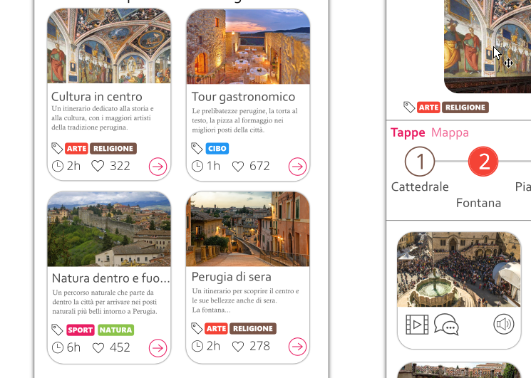
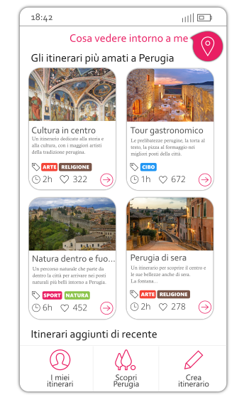
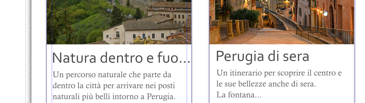
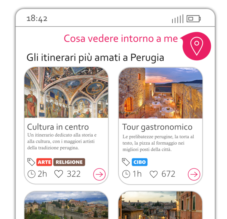
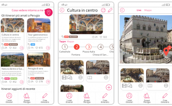
In the mockup of the app above, an app to browse tourist itineraries, I defined a graphic structure called card that I use (repeating it) every time I need to show a tourist route. It is therefore important that the tourist route is stylized with this graphic structure wherever it is shown, otherwise the design is inconsistent and the result is that the user will feel lost.
Creating components in the mockup
In any mockup software, when we identify a semantic structure to be repeated, we can use the grouping tool. Such an instrument is typically activated as follows:
- selecting a group of elements
- right button
- Create group
points 2 and 3 can often recalled with the combination CTRL + G (CMD + G on MAC).
When I have a group, I can reuse this structure using the Duplicate tool (commonly CTRL + D) to clone the newly created group and modify some textual element or internal image to create a similar structure with a different content, but graphically consistent. The mockup cards in the previous image were created with this technique.
Component development
When developing a front-end project, we can apply the repetition technique using web components. Like for the native HTML tags bold (<b>) and paragraph (<p>), the web components are tags created by a developer and that can be used in our web projects simply by integrating JavaScript files. Modern development frameworks use this concept and allow creating web components. Angular (https://angular.io) is perhaps the best of the current frameworks for developing a component system. We will see in another article what they are and how to develop a front-end system using components.
Alignment
Requirement
If you open a website and you experience an aesthetic nuisance, but you can’t explain why, there is a good chance that there is an alignment problem. A designer’s eye is well trained in this sense and can see misalignments in an instant. For us – developers – it’s harder to properly align the various elements because we are focused on the logical and functional side and often we do not mind the aesthetic part. It is therefore good to dedicate a few seconds at the end of an implementation to see if we have complied with all the alignments.
At a design level we can and indeed we must design our interfaces by respecting alignment. At a development level there are several tools that come to our aid, as we will see shortly.
Understanding alignment starting from an example
If we open the usual Google page with search results we will see that each result respects a line to the left and to the right.
Look at this mockup:
It looks pretty neat. And we do not need a surgical eye to obtain this result.
When we design a mockup, we can use guidelines to define object alignment.
At each level a few lines may be sufficient to create order in the design:
- at a higher level, we will define page lines
- at the component level we will define the lines for the specific component parts.
When defining the lines we always try to respect the same spacing and the same margins between related items. As for the repetition principle, here it can be useful to define 3-4 margin dimensions and always stick to them.
Alignment for the Web developer
For us, web developers, respecting the alignment of the elements means having well-defined style rules regarding margin and padding.
The padding defines the space between the edge and the internal content of an element, while the margin defines the space between the edge and the outside of an element.
In Chrome, among the developer tools, there is the tab style that provides us with various information on the margin and the padding of a specific element:
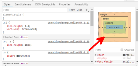
If we get used to using a CSS framework in our projects, it is often the framework itself that provides us with classes to force the alignment of the elements that make our page.
Bootrap and alignment
In Bootstrap we can manage the alignment using specific classes for margin and padding. Each class has a name realted to an alignment with a specific dimension. The logic of class names is very simple. To understand it we see some examples of a class:
- .mr-1 specifies a margin-right of dimension 1.
- Mr-2 specifies a margin-right of dimension 2
- .pr-1 specifies a padding-right of dimension 1
- .pt-3 specifies a padding-top of size 3
The first letter then indicates the margin (m) or padding (p), the second top, bottom, left or right (t, b, l, r respectively) and the number after the dash indicates l amount of spacing (in Boostrap there are 5 spacing levels).
Proximity
Need
Contrast is used to orient user focus, repetition to create uniformity, alignment to create order.
The last design principle that we will disdcuss is called proximity. Proximity is used together with the repetition principle to allow the user to easily and quickly identify structures. If the repetition forces to use the same style and the same colors for the same graphic component, with the proximity we must appropriately space different graphic components to distinguish them.
Understanding the proximity starting from an example
Let’s take the Google page as an example:
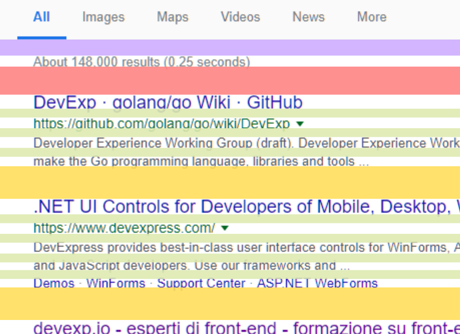
We can see that for each snippet the spaces between the internal elements (and between the lines) are small (in green), while the space between two snippets (in yellow) it’s much greater: more than double! Keeping the internal elements of the snippet close together and two snippets far away helps to make the user distinguish each result. The concept of proximity refers precisely to this principle: to keep elements that are part of the same structure (or graphic component) close together.
For a front-end developer this means designing a web component defining margins and padding inside the web component that are less than the margins and padding of the external container.
The more the page will have margin and padding, the more a component inside the page should have lower margin and padding. A component inside another component will have margin and padding even smaller. Once again there cannot be infinite levels of margin and padding, but we must use a few (for example the 5 levels of Bootstrap if we use this CSS framework).
Fonts and Design
In this section we will see the basics to design a web system with different fonts than the default ones and the techniques to preview them. We will also see some websites to explore free fonts and easily embed them in our web project.
The types of fonts
I will be very brief on this subject since the topic is actually very vast. I will limit myself here to show the basic concepts for a front-end developer.
There are two types of fonts: serif and sans-serif. Sans-serif fonts have straight letter ends, while serif fonts have small artifacts that are used to break up the space between one letter and another. These last fonts are used in writing and because of their characteristics they help reading.
How to use fonts
Using a single font in a graphic project is limiting because we do not have enough contrast. Since in the design it is necessary to create contrast, generally two fonts are used in a web project. More than two fonts can be used, but with caution, for two reasons:
- we risk to go against the principle of repetitiveness
- on the web, adding a font means slowing down the page.
I could provide generic rules for when to use a serif font or a sans font, but the reality is that knowing how to combine fonts requires a thorough knowledge that I would leave to the designer. A font in fact transmits particular emotions and only by mastering the subject you can choose with awareness.
As developers, what we can do is take inspiration from combinations suggested by other designers, as we will see shortly.
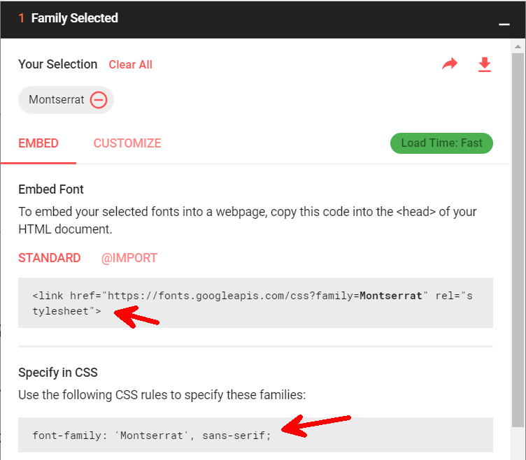
Embedding of a font
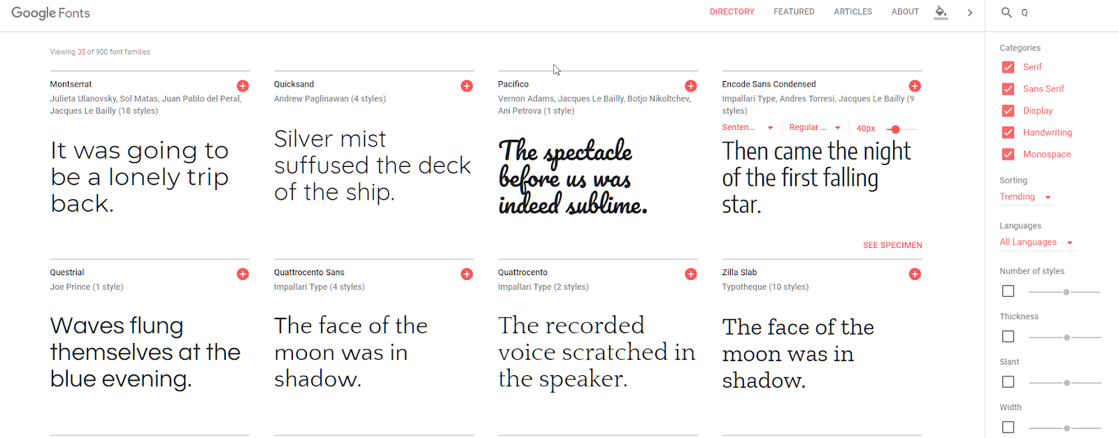
Probably Google Fonts (https://fonts.google.com) and Adobe Fonts (https://fonts.adobe.com) are the best resources to find fonts to add them to our website.
Through the intuitive interface it is possible to choose more fonts and for each font specific types of bold and italics.
To use a font on our web page, simply copy the CSS link generated by the system itself to our index page.
However, knowing how to embed a font is not enough. For a good design it is advisable to choose the right combination of fonts for titles and texts.
Fortunately, there are some websites that offer ready-made solutions of font pairs, showing a preview of how the pair will be displayed. Among these FontPair (https://fontpair.co) is a good one.
Colors: trendy palettes, the right combinations and tools for developers
Colors also convey an emotional message like fonts. You should not use too many colors and you should create the right color contrast.
Even for colors, it is good to rely on a designer.
As developers we try to follow some basic rules:
- use at most two basic colors
- look for contrast even in the choice of the two colors
- for the text, use a few shades of black
In any case there are different resources on the web for the front-end developers. Among these I suggest these sites where to find excellent palette combinations:
- For material colors: https://www.materialpalette.com/
- To create a palette from an image: https://www.canva.com/color-palette /
- For palette ideas related to particular themes: https://www.canva.com/learn/website-color-schemes/
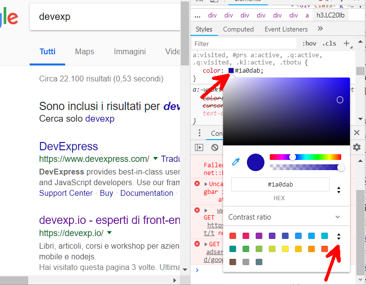
Also, before closing this brief session, I would like to point out the Color Picker available in Chrome to generate palettes and work with colors. To access it, once again, just open the Chrome Dev Tools and choose an item on which a style rule is set. From here you can:
- change the color with a picker on the various colors of the page,
- change the color using the gradient in the popup that appears to
- change the color specifying the value,
- change the color format (eg from RGB to HEX) to
- know the color palette on the page by clicking on the double arrow at the bottom (indicated by the red arrow in the image below)
Icons: icon styles, creation bases and the best sites where to find uniform icons
Often a developer does not have the necessary knowledge to build icons from scratch. Once again, however, I want to list the basic principles for the correct use of icons.
Below I will list errors not to be made and suggestions to follow to work with icons even without being a designer.
Common mistakes made by web developers with icons
- Do not take icons by searching them on Google individually.
- Unless you have a complete package created by a designer and that, therefore, can also be integrated with new icons in the future, I would avoid using icons that are too detailed.
- Don’t use icons with different formats and styles.
Tips for working with icons in web development
- When in doubt, use flat icons, that is icons drawn with a single color. This will make it easy to customize them.
- Use vector icons. It is not easy to create a package of icons from scratch, but respecting the dimensions of the lines and the style, we can combine different icons to obtain a third one. And if we use a vector format it will be even easier to combine shapes and parts of the icon with a tool like Inkscape.
- Among the vector formats, prefer the SVG format. This format can in fact be integrated directly into a web project and when the icons are flat it is easy to customize size and color directly via CSS. The SVG format is also directly supported by the best mockup software like Figma and Inkscape.
- Try to use icons created by the same designer. Fortunately, material icons are common today and there are numerous free sites where you can get excellent quality icons. Among these I point out the two most famous ones:
- iconmonstr (http://iconmonstr.com)
- FontAwesome (https://fontawesome.com)
Conclusions
In this article we have seen what are the basics of the design that every front-end developer must know even if he is not a designer.
By applying the techniques seen above we will always succeed and have a project that is consistent and clean. This does not mean replacing the figure of the designer, but rather working better with the designers and respect all the graphic details that are sometimes not even visible by the technical eye of a programmer.
When we have mastered these techniques, we can also begin to introduce some element of freshness and novelty, always remembering that it is important to respect the mental patterns of the users. If we introduce new design elements, we need more attention than before to be sure that we are improving the UX. Otherwise we risk to worse the quality of the system.
It is true that bold design choices create innovation, but bold designs that don’t work destroy the user experience.
Il libro definitivo per imparare Angular, con esempi, codici e l'esperienza che serve per essere efficaci nello sviluppare siti, dashboard CRUD o web-app mobile (Raccomandato con un punteggio di 5 stelle su Amazon)
Info sul libro + Codici e demo delle esercitazioni Libro stampato
Kindle
C'è una differenza tra programmare e progettare un software: il design. In questo libro viene mostrato il processo per arrivare ad un design semplice e manutenibile attraverso i design pattern
Info sul libro + Codici delle esercitazioni Libro stampato
Kindle
